Quick Wins: Bigger Images Means Bigger Baskets
How much impact do you think a simple product image has?

How important is imagery?
Alongside some more in depth case studies, I wanted to share a few a/b tests that were simple to implement, but had a huge impact on revenue. One such test was in tweaking the mobile product image size on our product tiles.
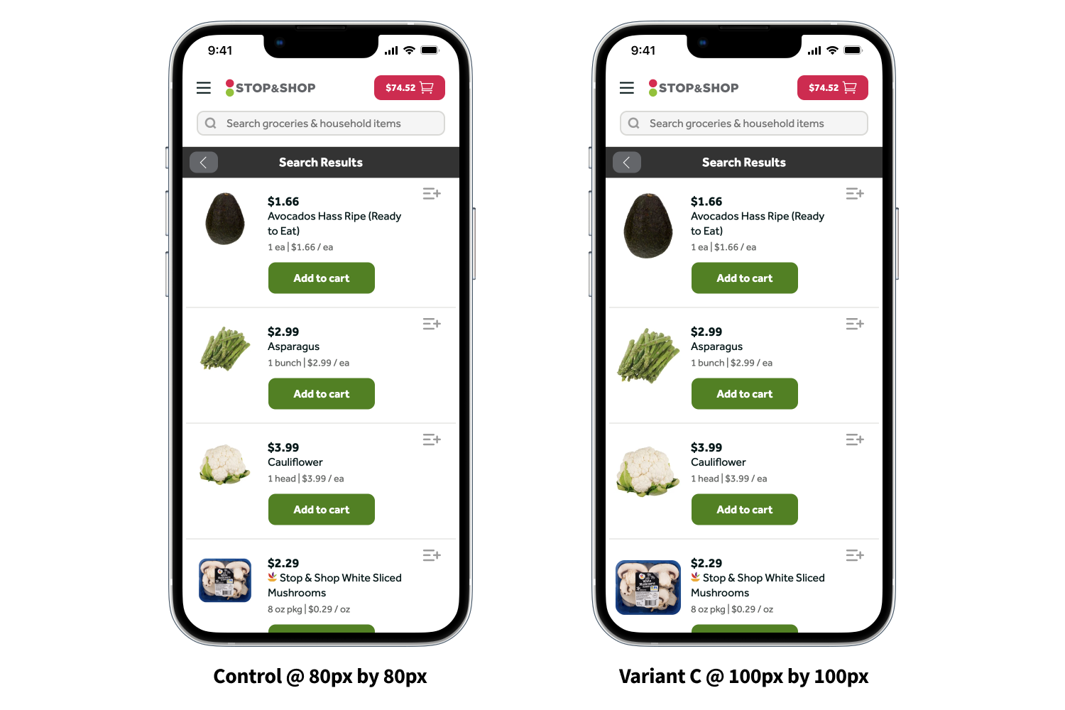
We had observed that many of our competitors were using drastically larger product images (Amazon being the most overt). We ran a simple test between control at 80px by 80px, Variant B at 90x90, and Variant C at 100x100.
What we saw from this incredibly minor adjustment was simply astonishing. This test was run across all of our brands for 30 days.

- Revenue per session went up 8.56%
- Basket size went up 3.65%
- Order conversion rates went up 7.23%
- Add to carts per session went up 6.46%
We were ecstatic with these results and all joked that we should just make the product images take over the entire viewport! Sadly, we ran a v2 of this test several months later increasing image size all the way up to 130px by 130px and noticed diminishing returns. This data was used to inform our new fully native app where product tile images sit at 112x112. Our team will continually look to optimize the image size of product tiles as we perpetually iterate on this crucial component.


