Creating Captivating Performer Pages Reduces Bounce Rate
Redesign and responsively develop one of the most impactful templates on the Vivid Seats mobile and desktop websites - the performer page.

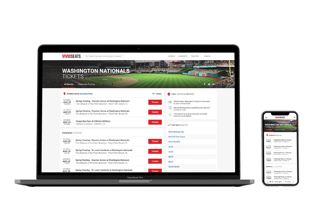
In the Spring of 2017, I led the efforts to redesign and responsively develop one of the most impactful templates on the Vivid Seats mobile and desktop websites - the performer page. This template, shared across all performers in sports, concerts and theater was often a direct landing page for many users coming in from organic and paid search and therefore their first impression of Vivid Seats.
View a current example of this page for reference.
Project Goals
We wanted the visual design to shine through and for the user to feel connected to the performer they were searching for. The challenge was to capture the attention of the users and set expectations for where they were in the flow while improving conversion. The goal was to increase click-throughs and decrease bounce rates while presenting a clear hierarchy of information and getting the user excited.
User Research
I began by conducting a user study in usertesting.com with 10 participants asking them to perform various actions throughout the page and provide general impressions and feedback. In addition to this qualitative feedback, I worked with the web development team to add GA event triggers to many neglected aspects of the template so that we could create a thorough map of all interactions. Lastly, I interviewed several of our senior customer service representatives to ascertain any pain points discussed through phone sales that this step in the flow may have offered.
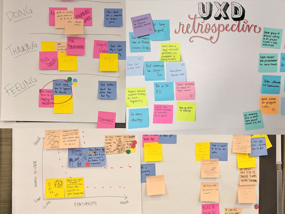
Pain Points
With this information, I was able to map out customer pain points with my team and begin affinity mapping and high-level brainstorming. At this point in the process, I would always invite the project manager and one or 2 devs from the product team to participate in this session as it would often shed light on new aspects we had not considered. It would also help ground our choices in technological considerations.
Design Solutions
This project involved several major stakeholders across engineering, product, and executives. After collaborating and receiving sign off on the wireframes, I worked with one of my UX designers guiding and critiquing dozens upon dozens of hi-res comps iterating through different approaches. Across several stakeholder presentations over multiple sprints, our final top three distinctive comps were then agreed upon to create a multivariate test.
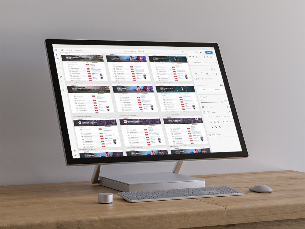
Split Testing
Our test ran for two weeks and had three variants plus control. We began by slowing rolling out the template to a few sports teams at a time before eventually releasing it to all sports teams for MLB, NBA, and NHL (the current in-season sports). In addition to the multivariate test, I ran a second user study with 20 participants in a script created to avoid order bias. At the conclusion of the testing, I had quantitative and qualitative feedback to present to our stakeholders and make a firm case for releasing the winning variant live to production.
Conclusion
Our final results were significant. Conversion rate increased by over 3%, bounce rates for this page went down nearly 60%, and we reduced the number of front-end templates from 91 to 8. Visually, I feel that we significantly improved the impact of the page, helped to excite the customer about their potential purchase, and brought it inline with larger design efforts we were looking to make throughout the site. In the end, we iterated a few more minor tweaks, then quickly released to all performer pages. This project was the touchstone for an upcoming UI overhaul and was a constant point of reference for design components and a champion for how the UX process works.