A Better Seat Selection Experience Leads to Better Conversion
A complete redesign and code refactor to develop a new, best-in-class tickets page for Vivid Seats.

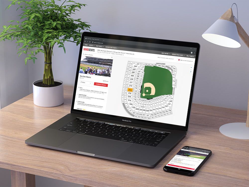
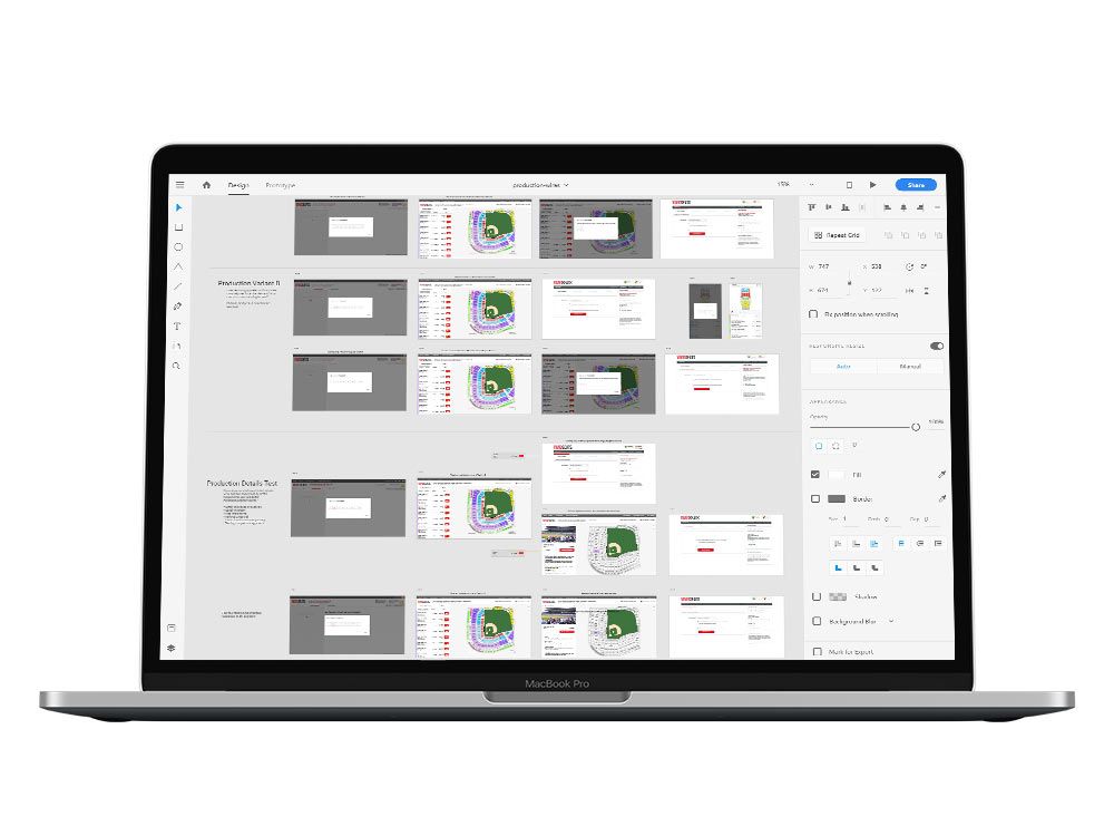
The production page otherwise known as the ‘map’ page or where customers choose their tickets is the most crucial page of the Vivid Seats flow. I had worked on several refactors to this page over my years at Vivid Seats, but in May and June of 2018, myself and a lead engineer on the web development team set out to lay a new foundation for this page.
View a current example of this page for reference.
Project Goals
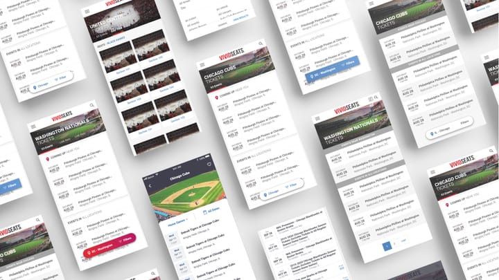
This new foundation would allow us to rapidly test new features and products across mobile and desktop. Previously, this was an adaptive template which served up a much smaller payload for mobile. The page was refactored to be fully component based and mobile first. The challenge was in the fact that the mobile and desktop versions of this page were quite dissimilar in information architecture. The goal was to unify both experiences while also improving several customer touchpoints and doing no harm to conversion.
Competitive Research
Researching our competitors was something we did quite regularly, but for this project, we wanted to fully understand the advantages and disadvantages of several different approaches. I developed a user test that had 10 participants go through several general activities across TicketMaster, StubHub, SeatGeek, and our website. This feedback helped to ground some of the larger information architecture changes we ultimately made to the page.
User Research
User research was of paramount importance as I had to separately test both mobile and desktop platforms to determine the customer delights and pain points. Additionally, with such a complicated page, keeping the customers focused on the areas we were changing proved an additional challenge. I began by creating a broad usability test of the page to gather data on likes and dislikes of the interface. In usertesting.com, I created a 20 question script that reached 10 qualified customers. With this information, we mapped out a matrix of mobile vs. desktop customer pain points. This gave important insights into what we knew had to stay as compared to what we had the opportunity to improve.
Wireframing
As I've mentioned, the information architecture was slightly different for the mobile and desktop views of this page. This presented a unique challenge in marrying the two together as a mobile-first responsive page. I focused on the modular components of the page, iterating through low-fidelity sketches, inviting my team to brainstorming sessions, and bouncing ideas quickly through Slack and InVision. These IA-heavy wireframes went through several rounds of revisions, presenting to our key stakeholders: the CEO and VP of Product. By comparing and marrying the mobile and desktop IA, we reached a solution that we felt confidently conveyed the critical information to users.
Design Solutions
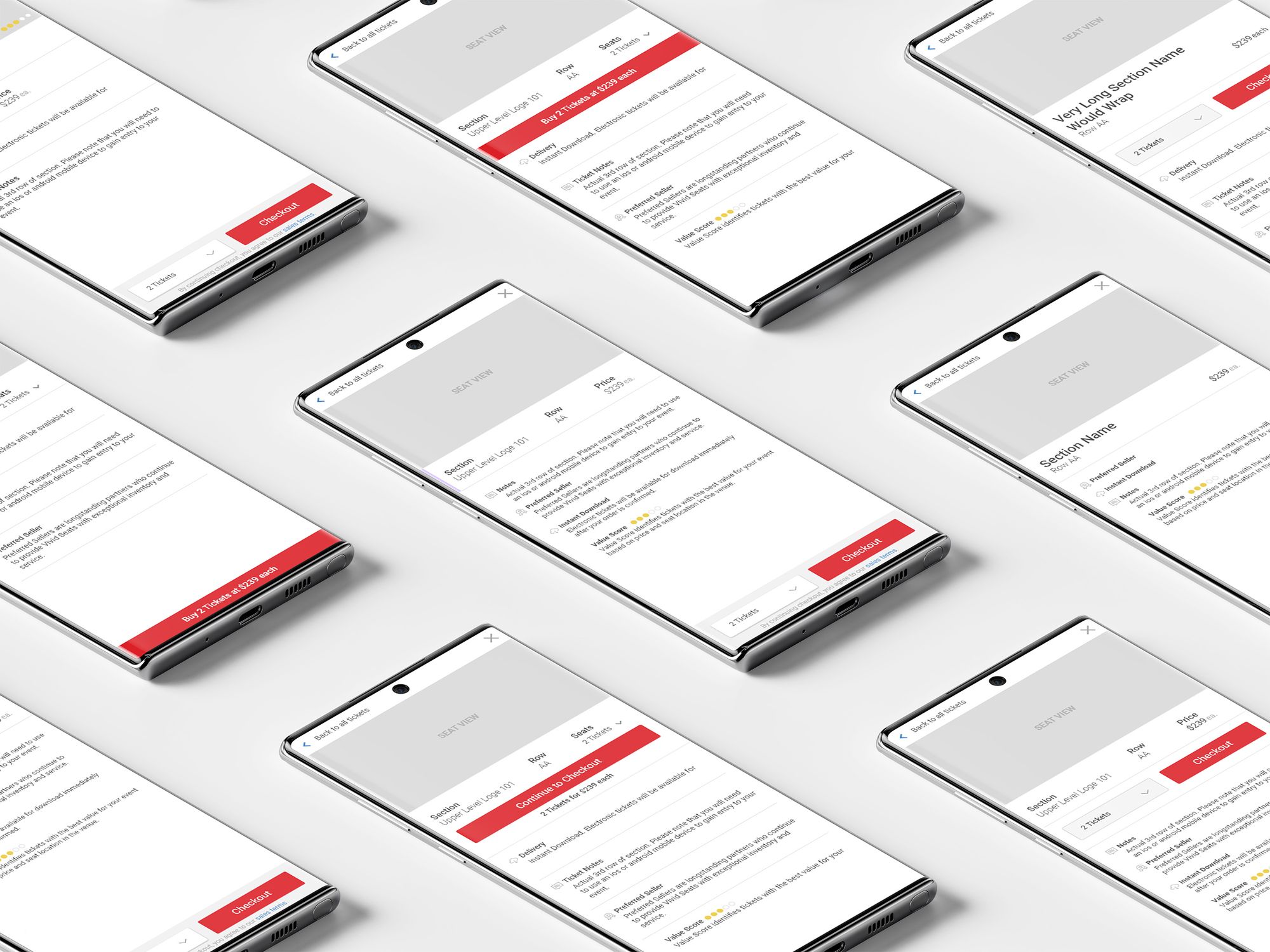
The purpose of this project was not a complete UI overhaul, but it still held opportunities for making several QoL improvements to the page and bring components inline with our design guidelines. The largest design change came for desktop in which we added a key feature from the mobile version: the ‘ticket details’ view. This introduced an intermediary step that highlighted three key pieces of information: where their seats were located in the venue, all of the disclosures about the tickets, and a clear indication of quantity and price. It also gave us the opportunity to create language through motion. The motion of our animations helped to connect users to the page in a delightful manner.
Split Testing
This project required a layered approach to testing so that we could be certain that the technology had no impact on conversion. The first test simply pitted control vs. the refactored code styled to look identical to control. After that baked for a couple of weeks and we gathered enough stats to prove it was winning, we released the main test. This multivariate test introduced the fully responsive template that added ticket details to the desktop view. It also opened the door for dozens more impactful tests that would come later down the road.
User Testing Again
As we ran the multivariate test, I interviewed a group of 20 users comparing control and the ‘ticket details’ variant. The results were overwhelmingly positive with a clear indication that users greatly preferred our new variant. I like to end many of my users tests with several questions that ask users to rank on a scale of 5 how much they liked or disliked certain features. With this data, I created a graph that makes it very easy for stakeholders to quickly digest the trends.
Conclusion
The result was a page that unified the mobile and desktop experiences, allowed for rapidly creating new multivariate tests (which we later did to much success in the form of ticket scarcity, urgency, and promo offers), and improved customer confidence in their ticket selections. We reduced and simplified the front-end code substantially which made it significantly easier for future changes.