Reduce Friction and Meet the Customer Where They Are
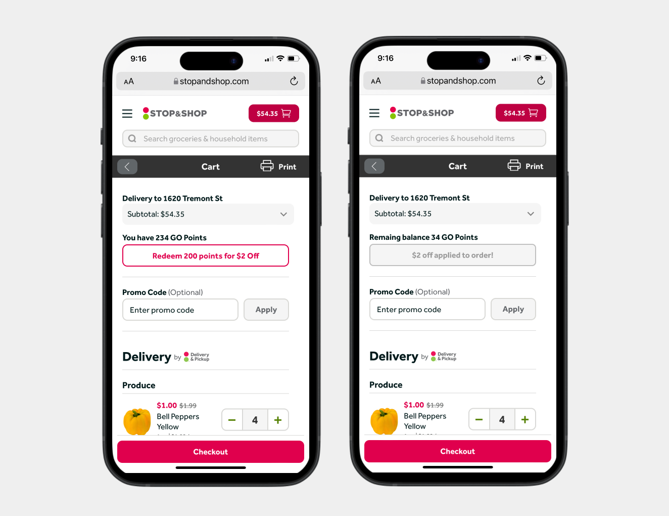
Give customers the ability to redeem their grocery dollar loyalty points in the cart.

What did we build?
We gave customers the ability to redeem their earned grocery dollar loyalty points directly in cart rather than having to interact with the rewards section.
Who are we doing this for?
Meet the customer where they are and reduce the friction of having to go out of their way to visit our Rewards section. Many customers were missing out on using these earned points and were simply letting them expire. By offering this feature in the cart, our goal was to increase the perceived value of the loyalty program and increase curiosity and engagement with our rewards section.
My Role
I led this initiative alongside a UX designer, content designer, product manager, and product analyst.
Introduction
Any feature like this begins with identifying a UX playbook of activities we feel we need to conduct in order for it to be successful. In this case, we began with a Lean UX canvas and empathy map based on a wide customer pain point: how can we stop customers from losing out on expiring loyalty points.
Our grocery store brands all have slightly different loyalty programs, but to simplify, customers earn points on every purchase that can be used for taking dollars off their basket (grocery dollars), used for limited time offers such as a free item, or donated to charity. These points are continually expiring on a rolling 30 day basis. As such, we found that many customers were letting their points expire (point breakage) without using them in any way whatsoever.
From a business perspective, grocery dollars are the best value to the grocery store brands as it typically leads to more items in the basket and a higher dollar spend. With this in mind, we conducted our Lean UX Canvas and Empathy Map to better understand what might be the best option for our customers.
Lean UX Canvas
The Lean UX Canvas is a handy tool that centers our focus on the “why” and shifts our thinking from outputs to outcomes. Despite often having a preconceived notion of what we might be building, it asks us to check our assumptions at the door and look at the problem from multiple angles.
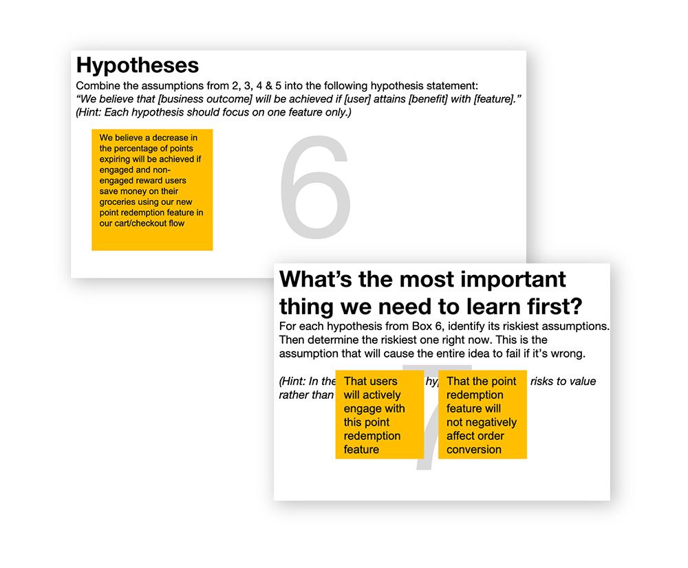
Some takeaways that emerged from this activity were:
- A broader understanding of customer pain points
- That this is a small step forward for what needs to be a much larger initiative from the brands
- That we could have developed multiple hypotheses to serve the different user types
- Clear next steps to pursue via a quick usability study
Empathy Map
To complement some of the outcomes of the lean canvas, we looked through our voice of the customer program for feedback from our customers around the loyalty program. Through this we were able to:
- Better understand what drives customer behavior
- Uncover customer needs that they may not be aware of themselves
- Guide us in that we are delivering what’s best for the customer
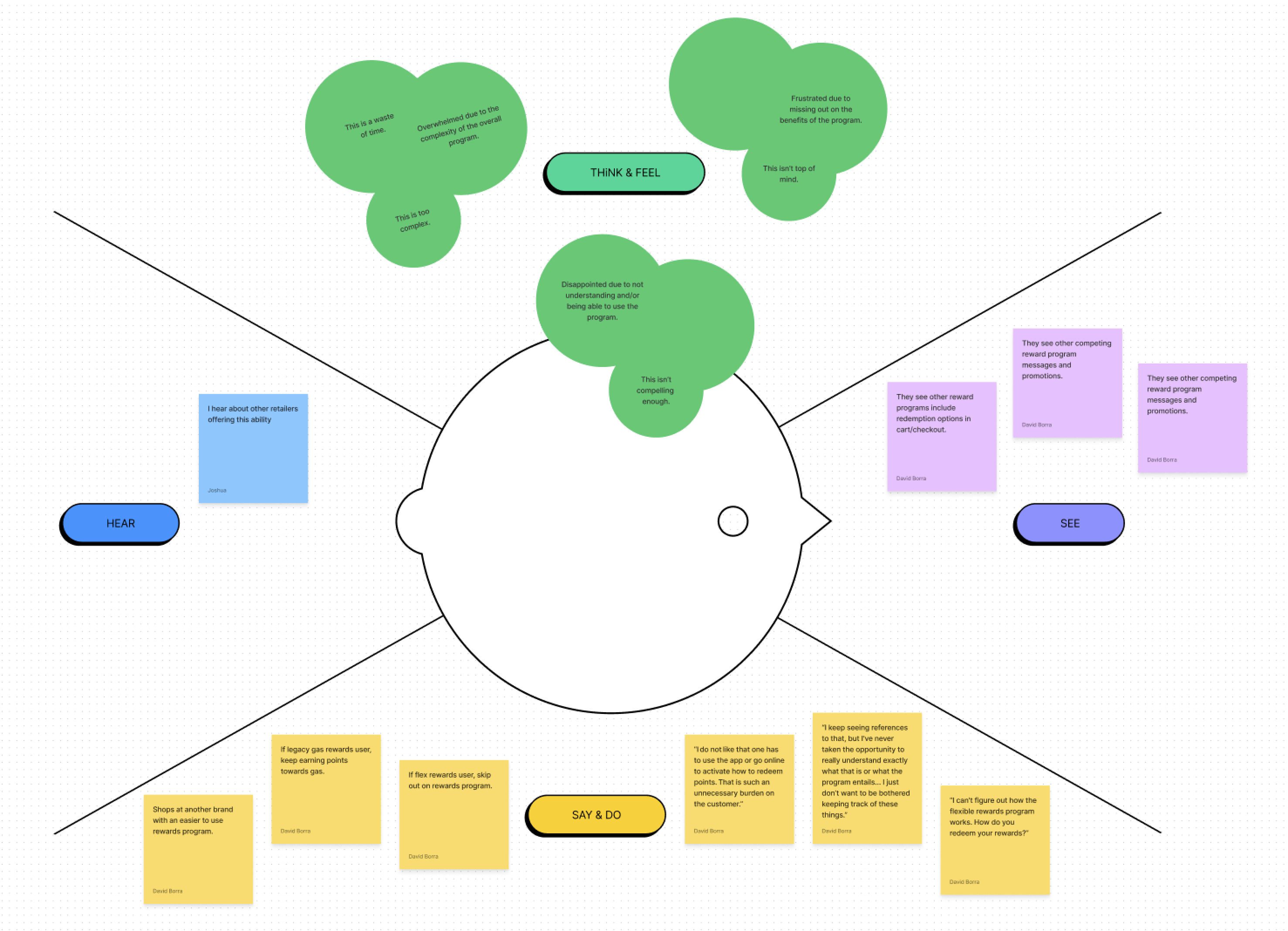
By looking at customer feedback, some themes emerged that we need to teach our customers how to interact with the program (learn by doing); introduce less friction, but not make it frictionless; put the value front and center. Many customers expressed not taking the time to fully understand the program - but everyone can easily understand taking dollars off your basket total!
Business Case
Working directly with our Sr. Product Manager, I helped define our business case with supporting metrics to share to our external and brand stakeholders. Digging into the numbers showed us that only about 25% of customers are actively redeeming their grocery dollar points - a huge opportunity. Additionally, point breakage was approximately 40% across our three loyalty point-based brands (Giant Food, Stop & Shop, and The Giant Company). A secondary goal from this project was to reduce the number of customers redeeming their points for fuel, which is very costly to the brands. We felt that by allowing easier access to grocery dollars, it would sway some fuel customers.
Competitive Landscape
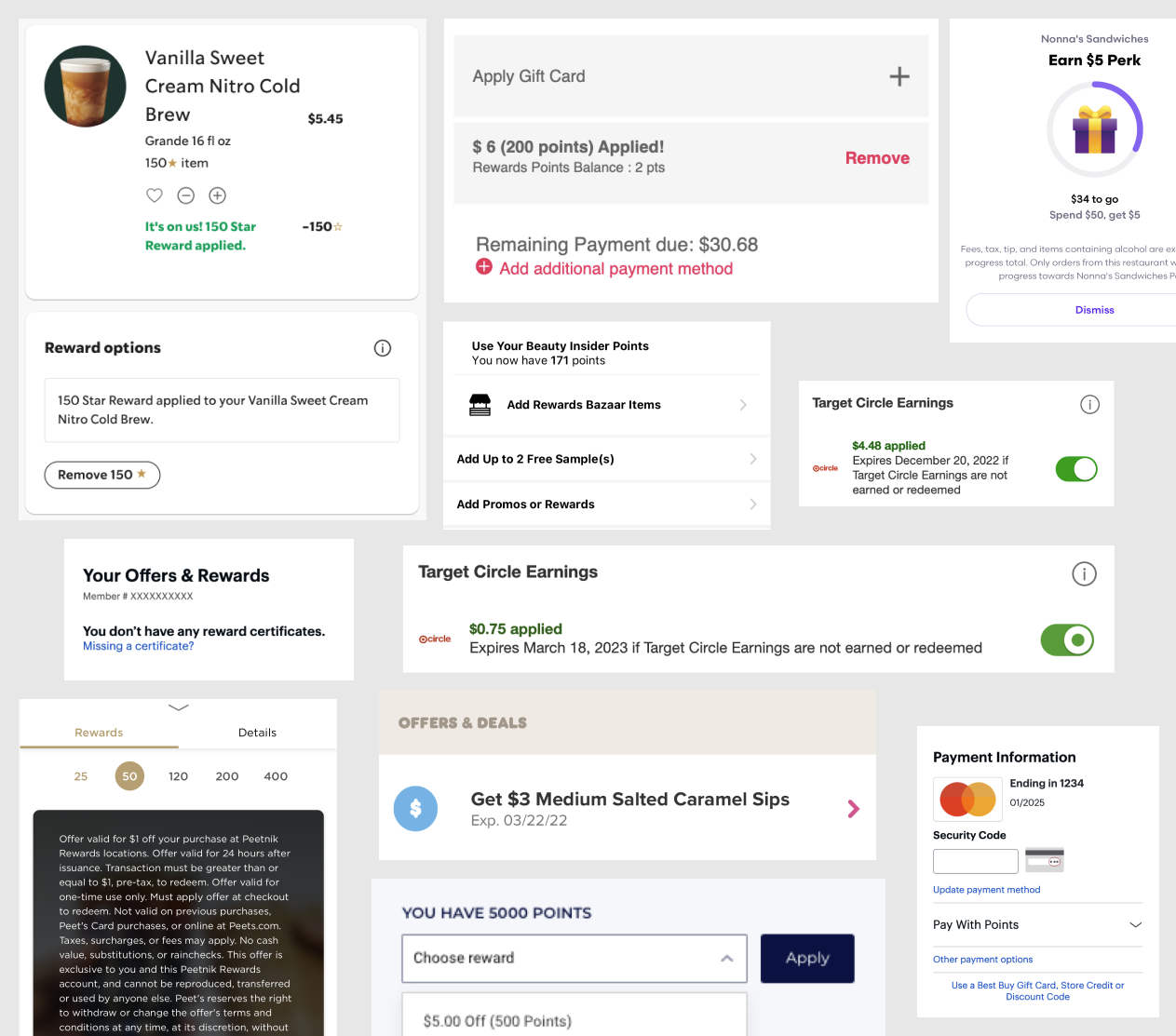
Conducting a broad landscape analysis across grocery and grocery adjacent loyalty programs revealed that redeeming your points within cart and checkout is a common retail pattern. We also noticed that it helps connect to the branding and value of each of these programs.
With cart being an area of high impact, we consider all the moving parts of what is currently in the cart as well as planned features that would be released soon. We worked closely with our cross-team partners that manage the cart and checkout experience to ensure that our feature would fit well into the customer experience.
Initial concepts
Simplified interaction vs. more flexibility
Thinking from a test-and-learn mindset with an MVP approach, our initial concepts asked us to consider two approaches: a single action vs. multiple. Did we want to overly simplify the interaction and just allow customers to redeem their maximum number of points for dollars off their basket? Or would we allow them a similar toggle to what they have within the rewards section where they can choose which denomination to redeem? As I stated earlier, we wanted to reduce friction, but not make it entirely frictionless as we want the customers to be aware of what they’re doing and also reflect upon the value of the program. We did not, however, want to detract in any way from this crucial ecommerce flow.
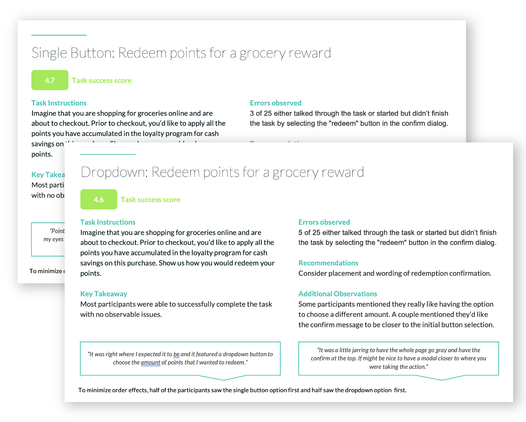
Usability Testing
We took both of these approaches into UserZoom for a quick usability study with some questions around that balance of flexibility vs. ease of action. Both designs scored very well, with the single button winning out slightly for ease while the multi-select had the edge for which one was preferred overall.
Further Exploration
We continued iterating on a few different rounds of ideas, from adding more prominent branding to the component, adding the main interaction and more description into a modal experience, to toying with several different interaction patterns for the component. Ultimately, we kept going back to wanting to simplify the approach from an MVP perspective. We felt that despite customers preferring the hypothetical multi-select, the data showed that most customers redeem their full point value. Since the points are always expiring on a rolling 30 day basis, most customers typically had between $2-$3 to use. With this in mind, we felt that our first MVP a/b test should focus on the single interaction.
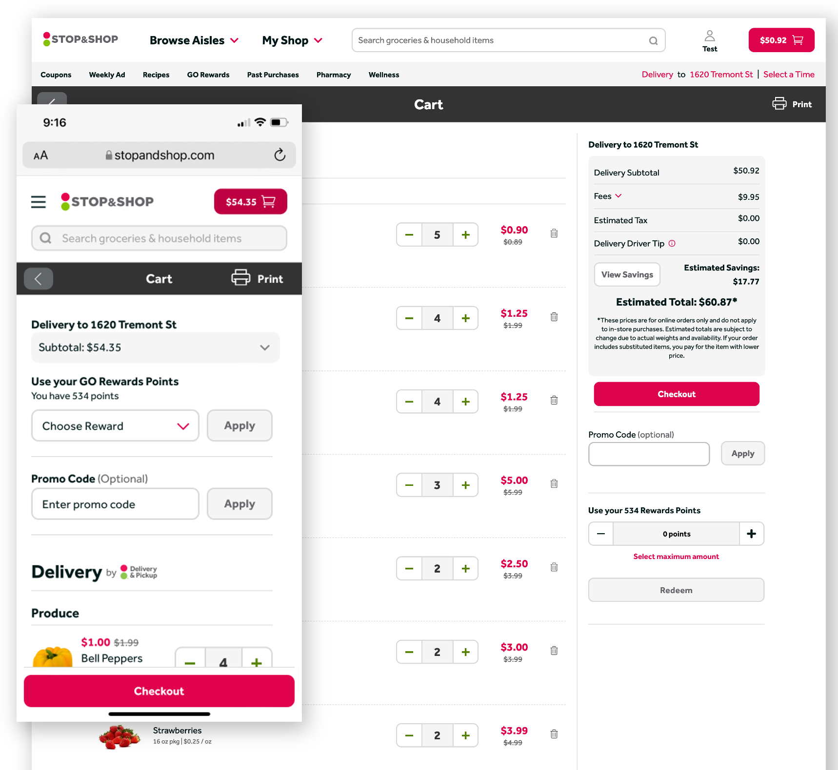
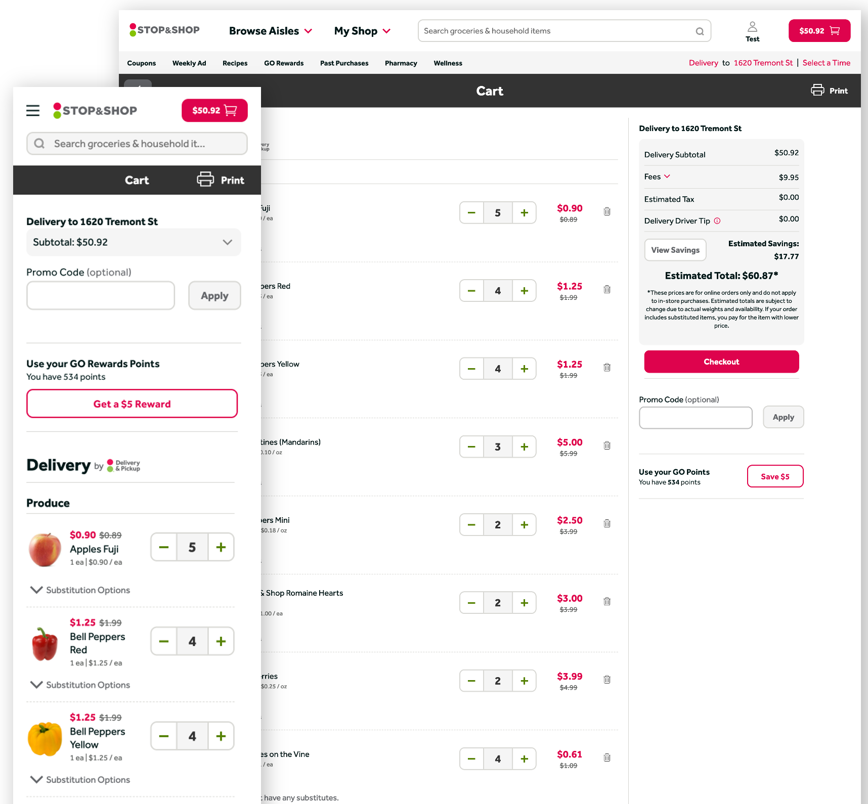
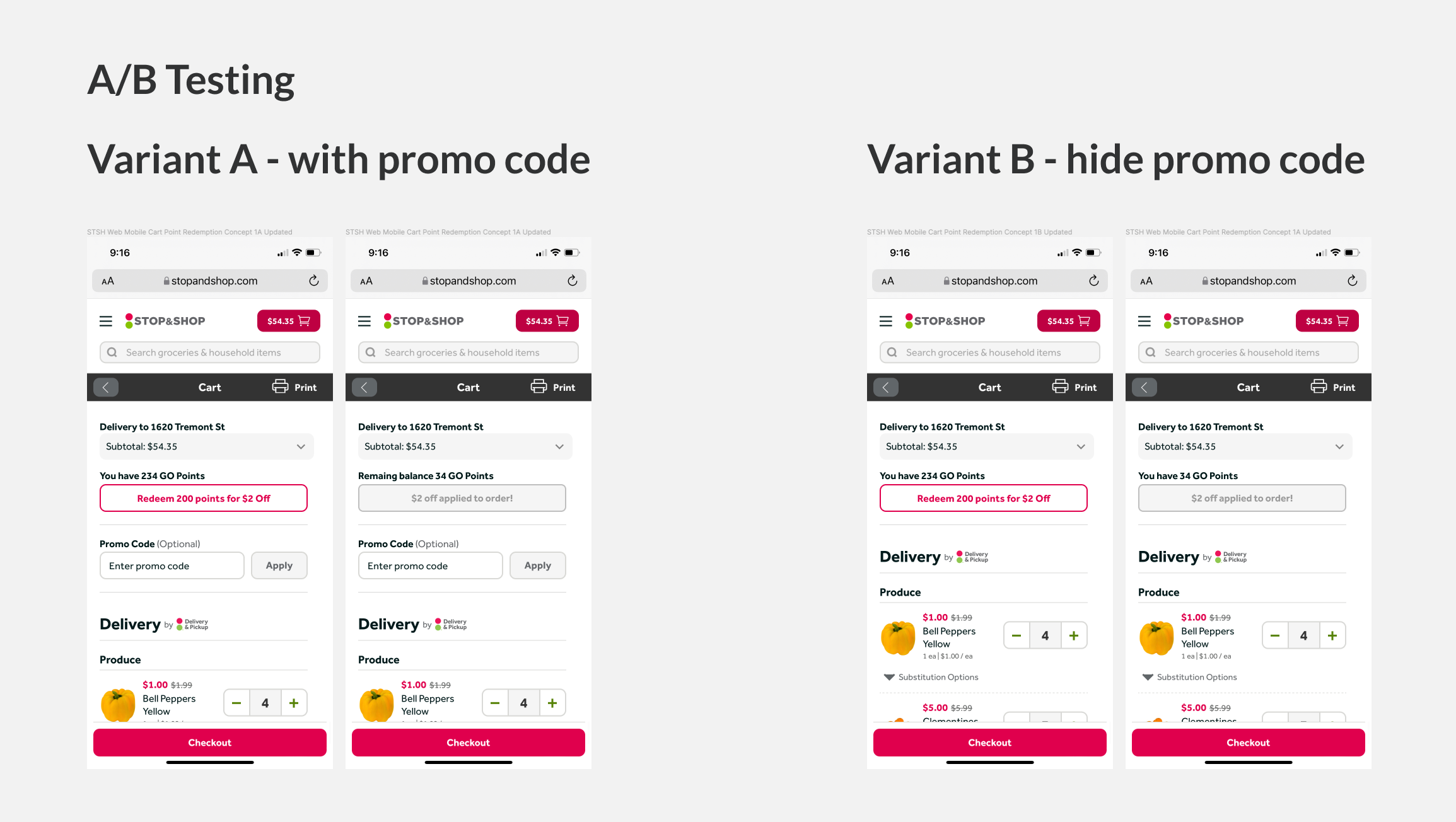
A/B Testing
With everything in mind, we narrowed in on this final MVP solution where our control was what was in production(A), and we tested between two variants where the promo code is shown(B) or only in cart(C). Our thinking behind this was to further simplify the features shown to customers at the cart, further reducing friction and moments where the customer may bounce to go exploring for promo codes.
Things we measured during this a/b test were:
- Primary metric - Adoption Rate. Determine the percent of customers who redeem their points in cart when this feature is available.
- Secondary metric - Redemption Lift. To determine the impact that the in-cart redemption feature has on customer behavior
- Business metrics - average order value and promo code redemption. Would there be downstream impacts on KPIs?
Results
We saw a 38% increase in point redemption with this first round of testing for variant B as well as a 2% increase in average order value! Variant C noticed at 30% decline in promo redemptions though had no negative impact on conversion or average order value. Despite this, we felt the best experience for customers was to keep promo code available in the cart. This test was conducted with a single brand, so our next steps were to test with the remaining brands, extend tagging in GA for better event tracking, and roll this out to our customers full time.
Next Steps
Once this feature has baked for some time, we plan to continue to iterate on the interaction, add some more delight, and expand so that customers may also choose to donate to a charity at this step in the flow.


