Next-gen Weekly Ad
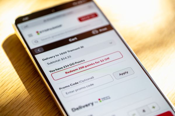
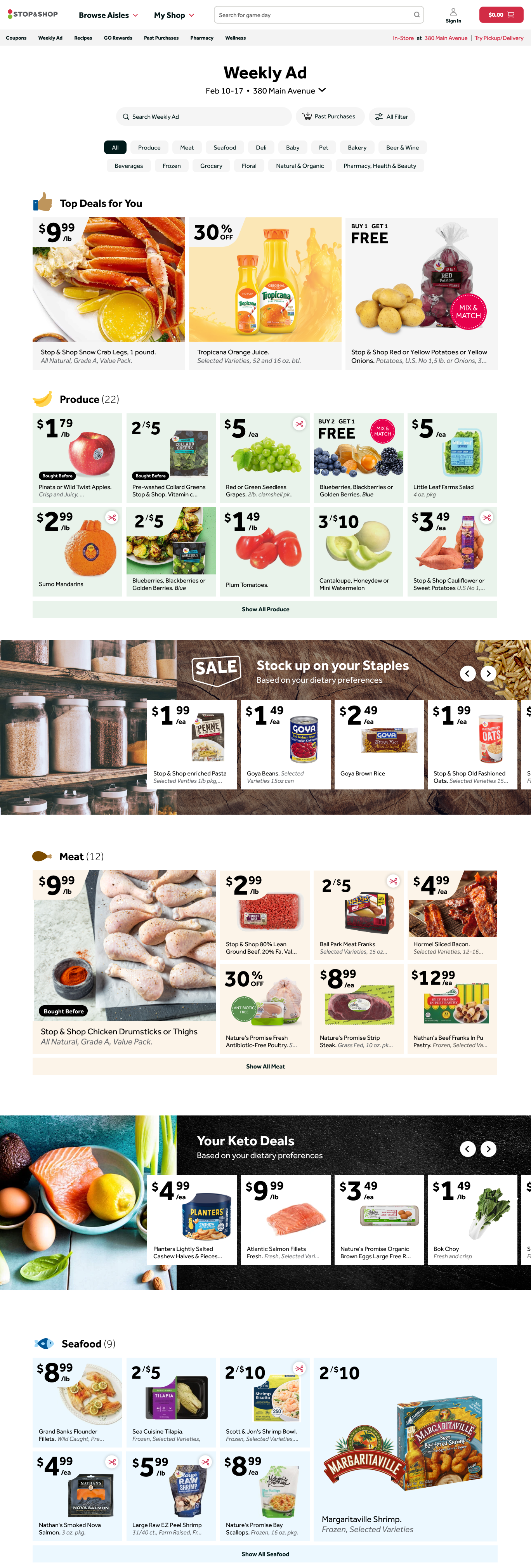
The weekly circular is a cornerstone for helping families plan their meals for the week and find the best deals in their area. But print is dying out, becoming increasingly expensive, and offers a brittle experience that is vastly outclassed by digital. Our goal was to develop the weekly ad from the ground up based heavily on research with our customers in an effort to begin nudging folks from using the paper printed circular to seeing the benefits of the digital experience. Here is the current weekly ad for reference (at the time of publishing this case study, these designs are not yet live).
I led this project alongside 2 UX researchers, 2 UX designers, a Sr. PM, and numerous partners across marketing, merchandising, and data science. This was a massive project, so the first step was creating a UX playbook of what we wanted to complete in order to define success for this project.
UX Playbook
- Blue Sky Designs
- Research: Diary Study & Interviews
- Research: Competitive Landscape and Current State Audit
- Proof of Concept for Personalization
- Design Iterations
- Usability Testing
- Measurement Plan
Blue Sky Designs
Conversation starters for the 2 week diary study
The true impetus for this project stemmed from two distinct moments: 1) one of our brands lost print distribution for a week costing them an estimated $300k in sales 2) a vendor demoed some vaporware demonstrating 'personalization' using 'real data' and the brands got really excited.
As a result, our first step in this project was to unpack the value of a personalized weekly ad. We had already committed to the idea that this wide-reaching of a project required an ambitious research study. In order to support the right questions for a 2 week, 50 participant diary study, we wanted to design some real conversation-starters.
Enter our 'blue sky designs' which strove to simplify the ad while maintaining the graphic-designesque look and feel of the printed circular. We went for two approaches to share with customers which we named Personalized & Organized and Value & Inspiration.
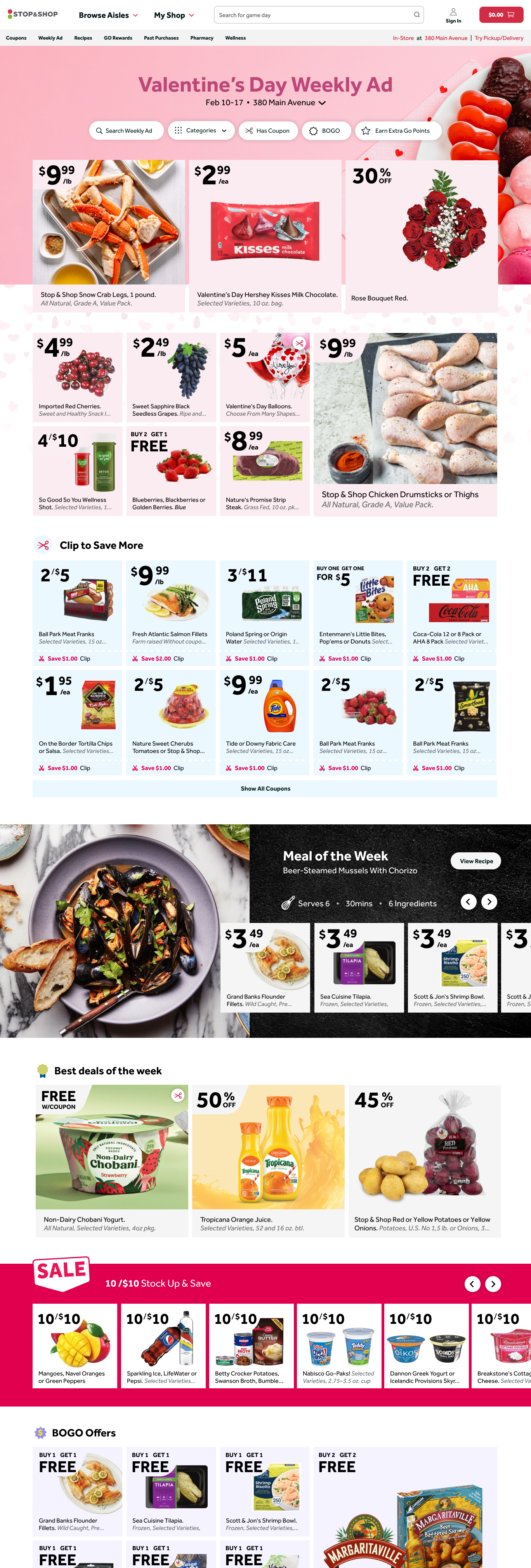
The design on the left offered a wider range of filters and sorting, immediately leading with personalized offers (Top Deals for You). It then went category by category with interrupting blocks highlighting other collections of deals the customer might be interested in. This design strove to put the customer's personalized picks front and center.
The design on the right simplified the tools and led with seasonal inspiration. The biggest difference between the two was that for this design, we chose to group offers by type rather than by category (coupons, meal plan, 10 for 10, BOGO offers, etc.).
One thing to callout: the weekly ad is the same for every customer based on the grocery store's sales for that week. As such, each person is seeing the same 300 (let's say) offers each week... the question is: in what order and emphasized how? I am over simplifying the complexity of these designs, but these served as the backdrop for a one hour conversation with 11 customers chosen from the diary study, which I'll discuss now.
Research: Diary Study & Interviews
We gathered over 700 in-context moments from 50 participants using weekly ads over a 2-week period. We then used 2 designs to facilitate a discussion with 11 ADUSA customers about the digital ad of the future.
The diary study used the "Jobs to be Done" framework to understand three key questions:
- Why do customers turn to print and digital weekly circulars and what do they seek to accomplish?
- How do customers interact with print and digital circulars across different brands and how does it fit into their shopping journey?
- How might we encourage customers to transition from a print ad to a digital weekly circular?
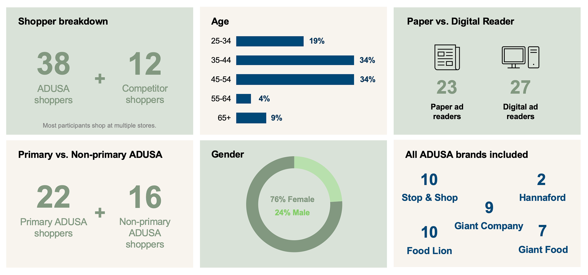
After following 50 customers for two weeks, observing over 700 contextual moments, we invited 11 representatives for a one hour deep dive each to discuss their observations and our blue sky designs. Across the discussions several "jobs" emerged: help me save money, help me plan what to buy and where, help me find inspiration.
When asked if the printed paper ad were to go the way of the dodo, we heard a wide gamut of answers ranging from, "I will be devastated if paper circulars go away" to "I understand this is where all retailers are going. I don't love it, but I'll adjust" to "I'm already fully digital and others should catch up". For print fans, it meant they could collect all their local brand's circulars and splay them out on their kitchen table to plan their week.
We realized print loyalists would be too hard to sway, but felt we could influence those that were intrigued by having the ad be more customized to their past purchases and likes. However, we found many folks were skeptical of an overtly personalized experience, saying things like, "That's a little creepy"; "But I don't want to miss out on other great deals"; and my favorite:
You don't know me, I want to see all deals even if they don't apply to me.
From our key research questions and the main "jobs" customers hired to be done, we developed four key principles that defined the rest of this project.
1. Optimize the weekly ad to help customers save money, plan what to buy, and find inspiration.
Customers use weekly circulars to complete three main "jobs to be done". If what we build doesn't help them accomplish these jobs, they will find another place to shop. The most important task being to help customers save money.
2. Start with UX Improvements that strengthen the pillars of a good digital ad.
There are three pillars of a good weekly ad experience:
- Clear and captivating pricing
- Intuitive navigation and organization
- Interactivity that supports processes
Any digital ad redesign should include clear and captivating pricing such as highlighting the top deals at the store, show the amount of the savings, and explain how to get more savings like additional coupons. Organization by categories can make the ad easier to use as it matches how people shop in-store. Options to navigate with filters and search can give customers control and reinforce relevancy of the ad. Customers don’t want to have to create new routines to use a digital ad. Enhancing interactivity such as 'circling' items, clipping coupons directly from the ad, and integrating with external shopping lists will help digital adoption.
3. Personalize the weekly ad quietly and with intent.
Personalization ultimately did not help customers complete their jobs to be done. There were too many skeptics that felt it might help them, but that they would still need to review the entire ad even if offers didn't pertain to them. Beyond saving time, we must develop personalization elements that clearly show customers how this will help them save money, plan shopping, and find inspiration.
4. We must nudge customers to adopt digital circulars while the paper circular still exists.
People naturally resist change. We can’t fundamentally alter their routines. We can’t expect customers to adopt digital overnight. We need to start with nudges now, while both paper and digital formats exists so paper readers can come to appreciate what the digital ad offers.
Small nudges that chip away at the reliance on paper look like:
- Integrating QR codes in the ad and store to link directly to digital experience and offers
- Instituting SMS, email reminders, or notifications informing paper readers the digital circular is available
- Focusing on features that honor the paper readers process such as print view defaults, interactive meal planning, and flexible digital navigation
These four key principles formed our path forward for the remainder of this journey and served as a touchstone for each choice we made along the way.
Research: Competitive Landscape and Current State Audit
Define the lay of the land and note our existing pain points.
Concurrently with the diary study, myself and my two UX designers began scouring the competition and auditing our own experience. In the tech space of weekly ads, there aren't very many vendors - with regional grocers picking between one of two camps. Smaller grocers even employed fully static assets, making their digital experience a glorified PDF.
Competitive Landscape Analysis
For the competitive landscape we looked at five other grocers, chosen due to their variety of weekly ad styles and technical vendors. Some common themes that we observed were that many brands were already transitioning from paper to digital by heavily promoting their website/app on the front page; most brands defaulted to the 'print view' experience that feels more familiar than a digital-first layout; most vendors included shoppable offers, the ability to clip coupons, and monetized zones.
Our high level takeaways from the competitive landscape were:
- All brands have similar digital counterparts to the paper circular
- Mobile web is poorly optimized across the board
- Clarity of pricing has a lot of room for improvement
- Balancing pricing clarity with clean and consistent design is a challenge
Current State Audit
We conducted an end-to-end audit of the paper circulars as well as the mobile web, desktop, and app experiences across all of our brands. We sought to uncover pain points and review all of our voice of the customer data on this topic. We also wanted to fully understand our API implementation and any technical restrictions. Lastly, we wanted to identify any areas of opportunity.
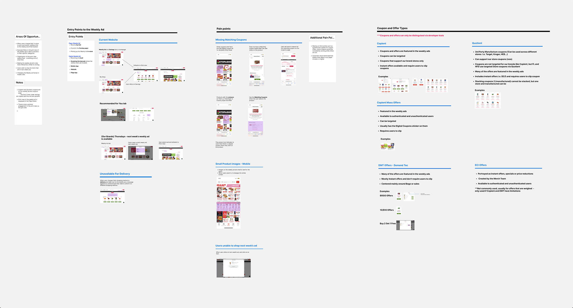
Our summary from all of this broke it down as such:
- Our current vendor comes with a lot of baggage and does not get access to 1st party data
- Performance issues and bugs prevent the reason customers come here: for meal planning and inspiration
- The mobile experience poorly restricts pinch and zoom and has unoptimized mobile interactions
- Customers shared the sentiment that they felt there were more deals available on the paper circular than the digital counterpart
With knowledge under our belts about what others in the weekly ad space were doing as well as a firm technical understanding of our current approach, we then combined this with the diary study to begin initial concepts.
Proof of Concept
A quick aside to some technical stuff
The goal of this POC was dead simple: demonstrate that we can display our current weekly ad grid view using real, personalized data.
Part of my role in leading this project includes working cross-functionally to help define our algorithm and understand business needs for the weekly circulars. Luckily for me, the data scientist we paired with on this project was a former PM that I used to work with which made collaboration super fun. We sat down to identify how we would structure our approach.
The first step meant we had to bypass our current vendor and send real 1st party data through our data science algorithm and then pass it to the back-end. We had to learn how to get this feed from our internal app and clean the data for web. We also needed to vet the feasibility of personalization using one of several different models the DS team had developed. We wanted to be able to demonstrate to stakeholders the value prop of native personalized ads. Lastly, we needed a way to test the effectiveness of the algorithm, identify user personas, and observe behavior across our many customer segmentations.
After a few sprints, we developed a staging environment that included a toggle on the weekly ad page allowing us to switch between any of 11 different personas that represented the main customer segments our DS algorithm defined. Overall, the goal of the POC was to assess the viability and potential impact of using personalized ads in a real-world scenario and make informed decisions about the features and experience for a full-scale implementation. We used this artifact later in our demo to the brands alongside our final design approach.
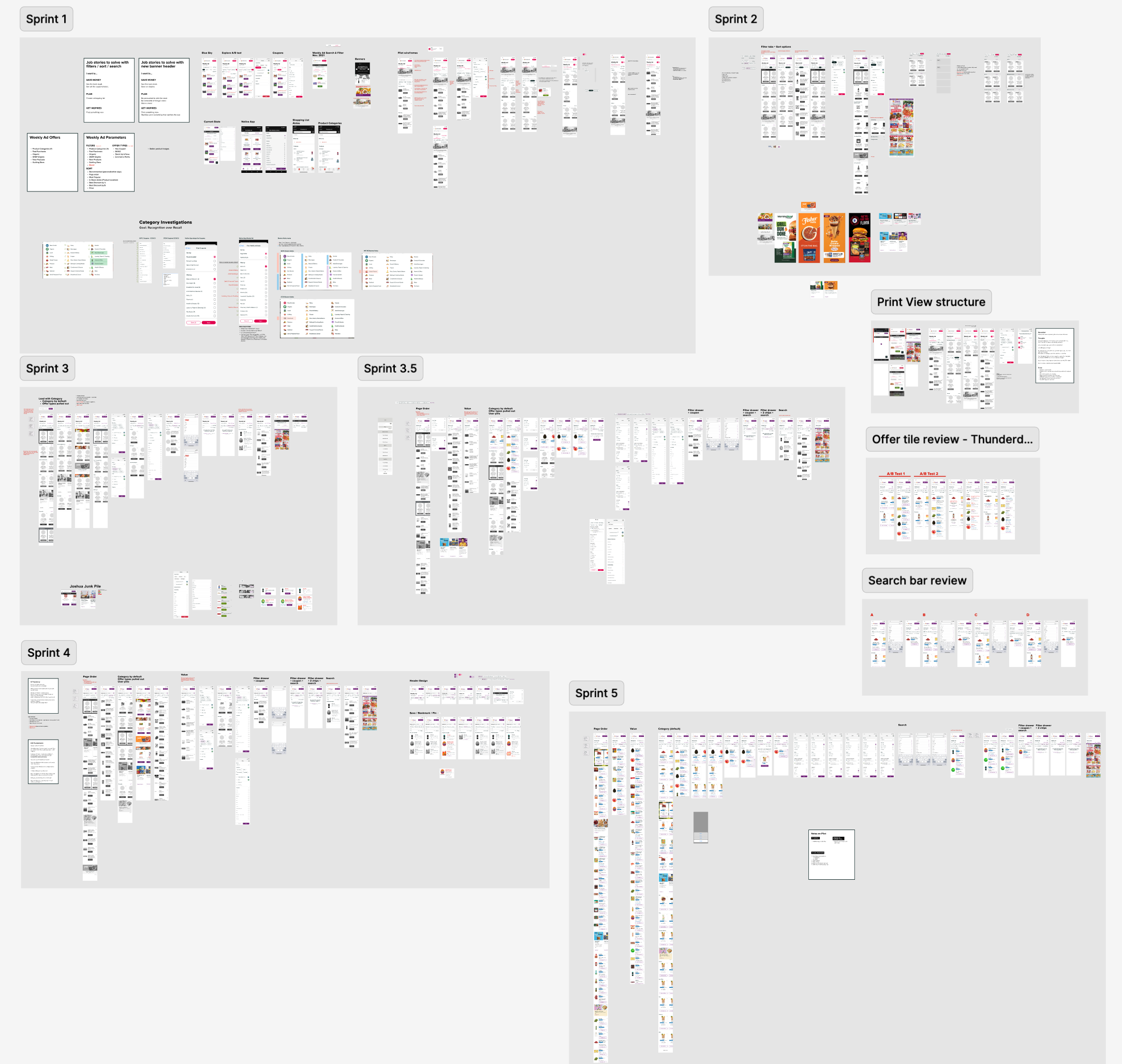
Design Iterations
This is what you're here for, right?
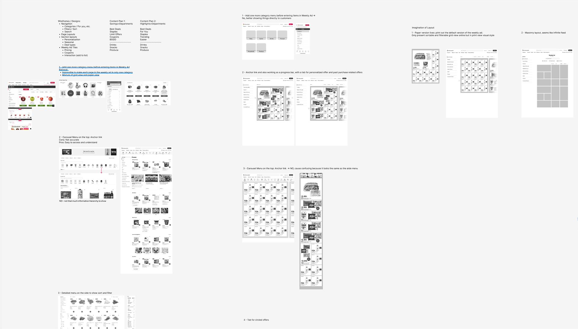
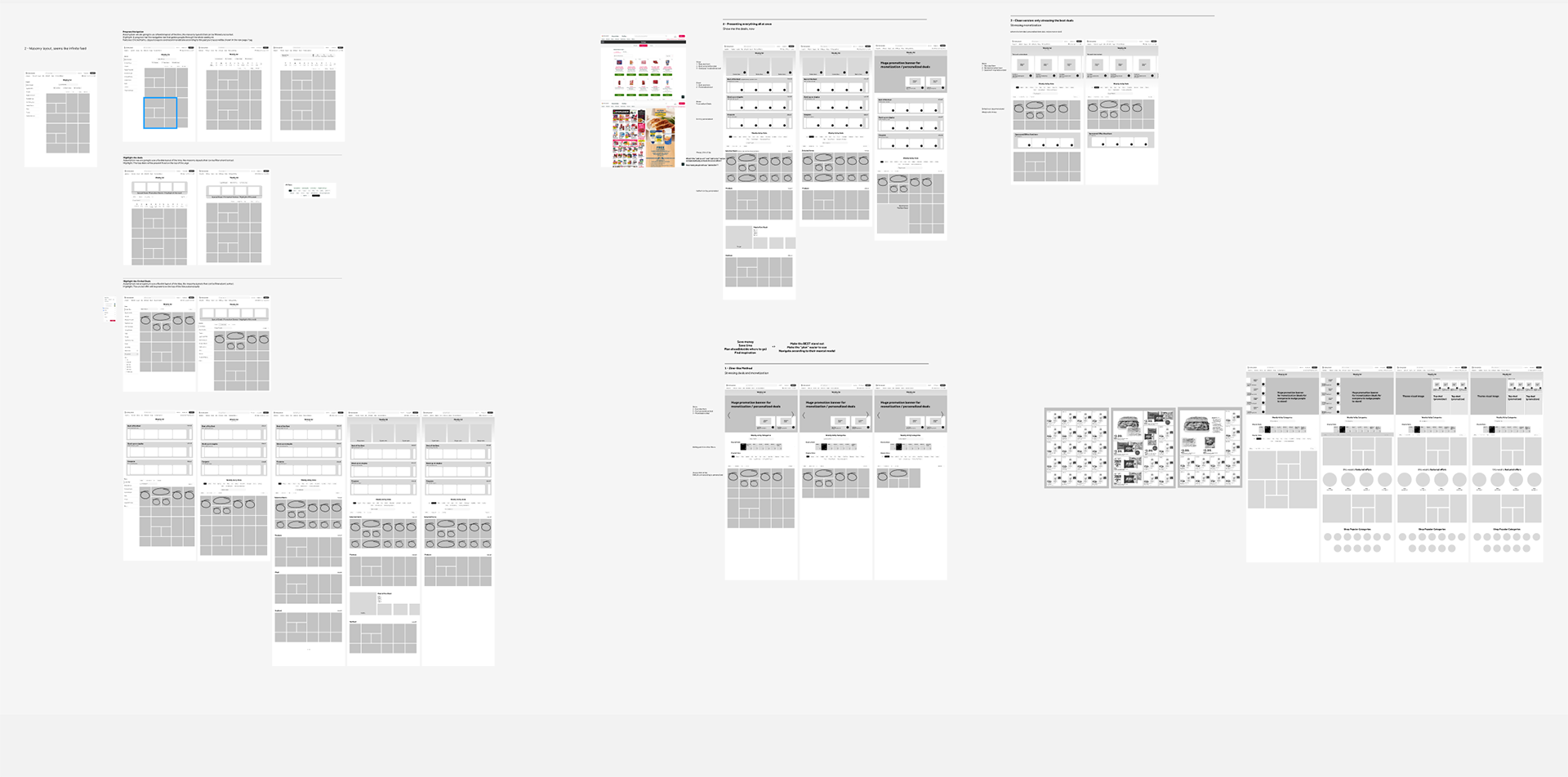
In the early moments of iteration, we began quite broadly - taking great liberties with information architecture, image quality, and things we probably knew were impossibly tagged. While ultimately anything was on the table, I didn't want to stifle my team in the early weeks of designing as some of these ideas paved the way for others and some even lived on to the final designs. However, as the POC developed, I was able to share insights with my design team to bring us back down to earth. We took a lot of early inspiration from the more magazine-like approaches of some of the better players. We hoped that our CMS could eventually accommodate complex components with fluid layouts.
Wireframes / Low-fi Designs
I tasked my two designers to each focus on a different aspect: offer tile and layout. Our product tile is something we have been perpetually designing since my time with ADUSA, so tackling a potential redesign of the offer tile was no small feat. However, with the key principle of clear and intuitive pricing, we at least had a north star to head towards. Similarly, for layout, we knew that intuitive navigation and organization was paramount. We also knew that enhanced interactivity would be a key for customer adoption.
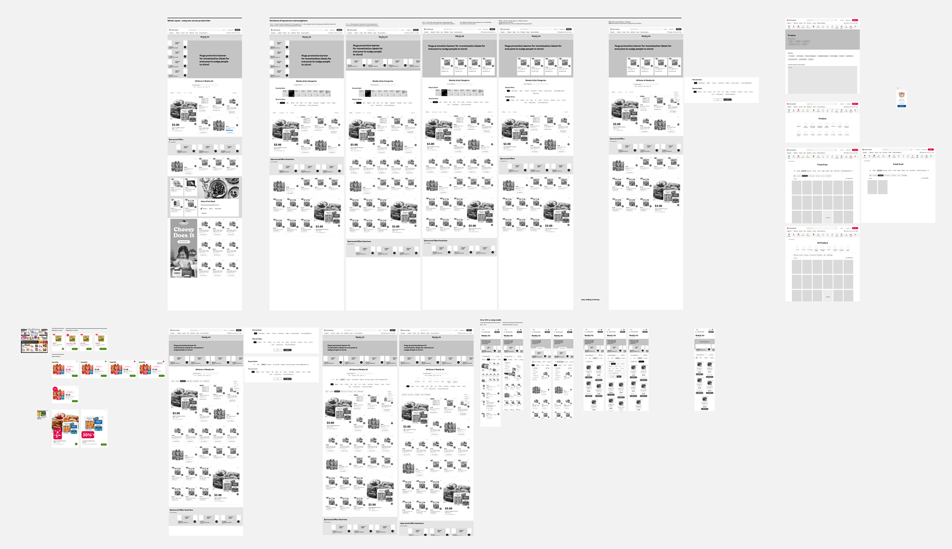
After spending a few sprints iterating (roughly aligning with the finishing of the POC), we pivoted from designs to a discussion around defining the MVP. Meeting with our PM, lead data scientist, and research manager we mapped out what an MVP might look like. We white-boarded in the office in Chicago and walked away with a new concept of running a pilot with a single brand. We documented which features would make the cut and which were deemed out of scope. We identified risks and mapped out a timeline. My team now had a clear goal of when to begin usability testing in order to meet the development timeline.
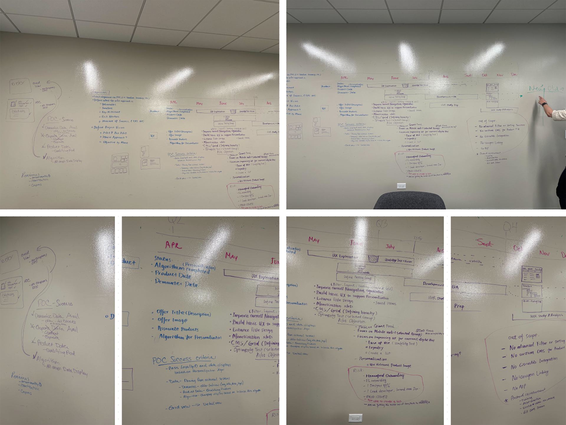
With the MVP scope and requirements fully defined, transitioning from wireframes to mid-fidelity designs felt quite natural. Part of what we left behind was the idea that we were going to drastically redesign the tile itself and instead focused on updating the existing IA with some new elements that we wanted to highlight. During these few weeks, myself and my lead designer meet constantly to critique and hone in on our approach with full team critiques weekly as well. By the end of our self-imposed deadline, we had something we were truly proud of and felt would confidently pass usability tests with flying colors.
MVP Pilot Approach
In order to better understand where we landed, let's first define the pilot and what we hoped to accomplish. We wrote a vision statement so that everyone (including stakeholders) could be aligned to what we were building.
More specifically, we decided to focus on what we called an "enhanced grid view" and target mobile web only. Most of our traffic goes to mobile - either to native apps or to the mobile browser, so it makes sense to focus our efforts on solving for that platform first. Larger layouts on desktop makes everything easier, so this forced us to ruthlessly edit and pare down.
Additionally, we decided to focus on one brand as part of the pilot and committed to running a second diary study with 50 participants for 4 weeks. We knew that a simple a/b test wouldn't cut it as we would not gather enough qualitative feedback. A usability test would help prove simple usability, but without using real customer data to test the validity of the data science algorithms we wouldn't know if our approach to personalization was working as well as we hoped. We narrowed down a few more criteria and then set forth to finessing the final designs.
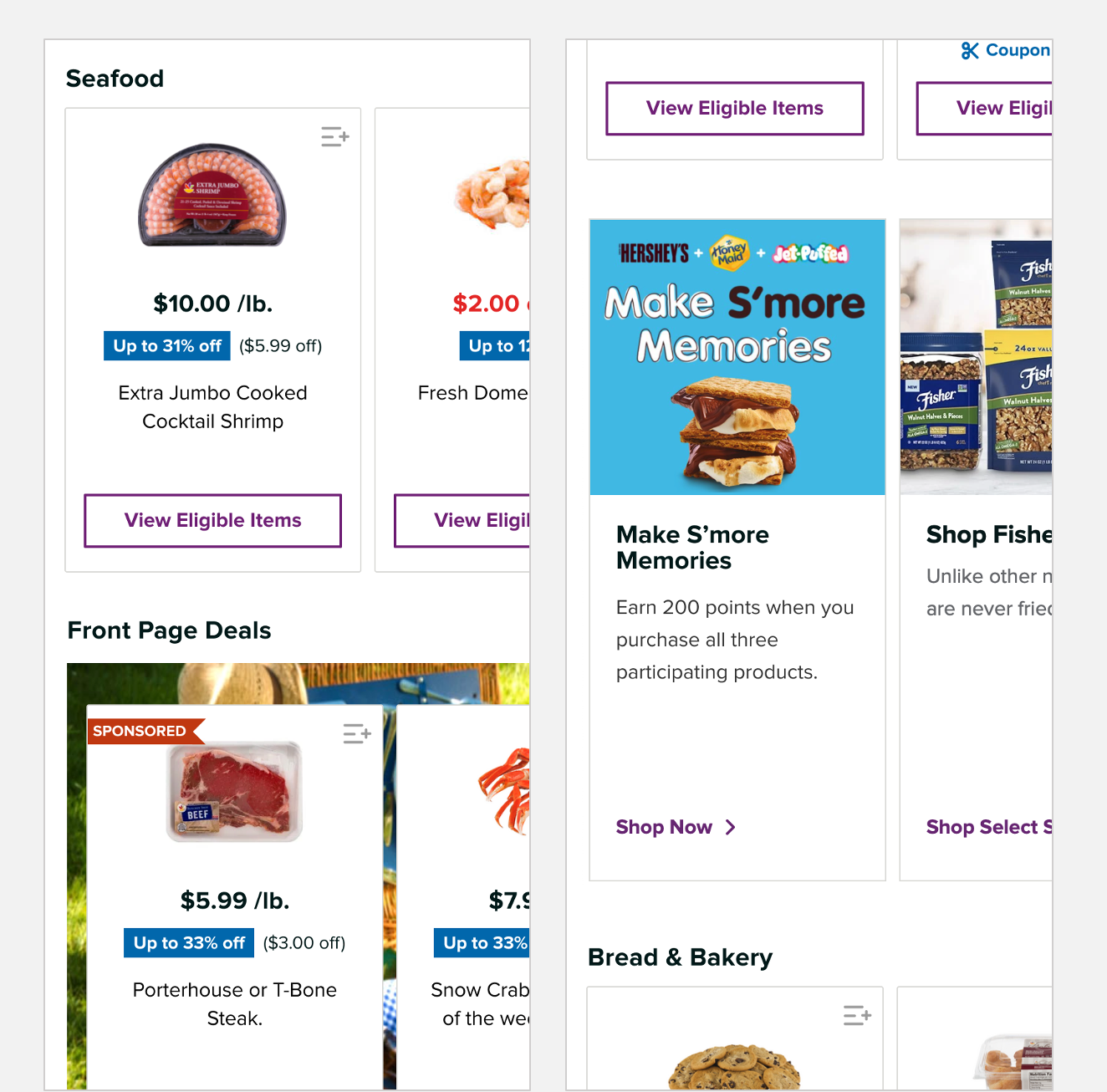
Final Designs
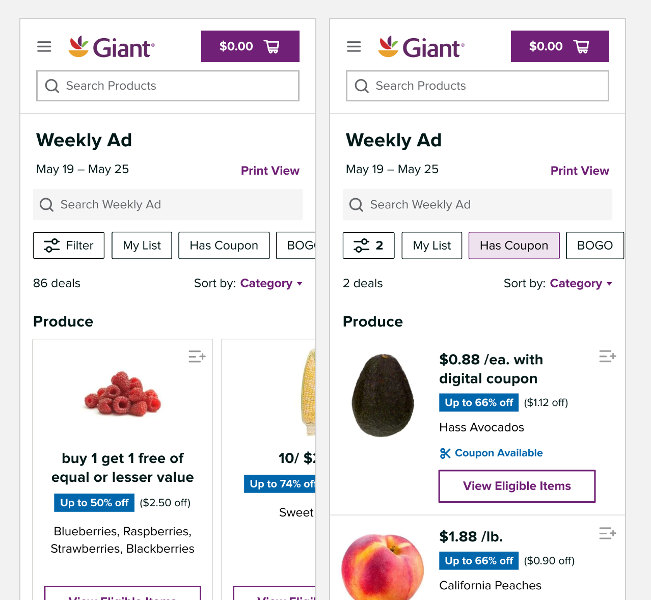
To summarize our final design choices, we can group the changes into four buckets: Navigation, Filters, and Sorting; Offer Tile; Overall Structure; and Other UX Improvements.
Navigation, Filters, and Sorting
- Clear and dedicated search specific to the weekly ad
- Filter drawer exposes most common filters with docked access to "All Filters"
- My List allows customers to create a weekly ad short list (that is also added to their full shopping list)
- Simple CTA for switching to the "Print View"
- Sort by defaults to personalized categories with the option to sort by best % and % off (as well as most recently added 'page order')
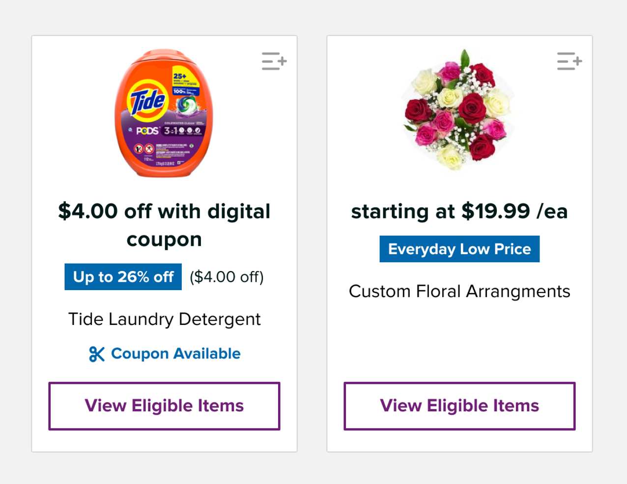
Offer Tile
- Large, personalized image for the offer (using product images instead of 'offer' images). The image shown will reflect the top item in the offer for that customer (think flavor, variety, type, size, etc.)
- Clear and intuitive pricing showing offer price, percentage off, and dollar off.
- Coupons available callout will be accurately shown wherever additional coupons are available
- CTA changed from "Shop Now" to "View Eligible Items" to support both ecommerce and brick-and-mortar customers.
Structure
- By far the biggest change: default to personalized category view of offer carousels
- "Front page deals" carousel allows for customizable CMS featured offers - a key business strategy
- Large tiles allow for non-offer content to be highlighted (a shortcoming of the current weekly ad grid-view experience)
- Monetized zones allow for further CPG partnership opportunities
- Sort by % or $ changes offers from carousels to list view, sorted by best discount first
- Selecting multiple categories in the "All Filters" drawer also puts offers into list view
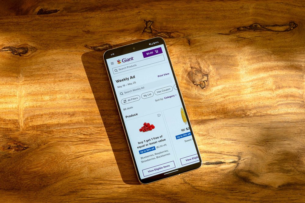
To expand on the topic of personalization, this will be done three-fold in the pilot. Firstly, the order of carousels will be personalized such that if I buy mostly produce and diary, I will see those carousels at the top of my list. In other words, they will not be in a static order, but unique to each customer segment. Secondly, the order of the offers within each carousel will be sorted by past purchases and adjacent items so that the offers that a customer might find most enticing will be the first they see.
Lastly, as offers can house as many as 50+ items, the order of those items will be personalized so that the customer sees any past purchases or DS algo identified items at the top of the 'shoppable items' modal. Let's take the example in the prototype embedded below: a customer sees "buy 1 get 1 of equal or lesser value" for "Blueberries, Raspberries, Strawberries, Blackberries". If a customer is more prone to buying raspberries, they will see the product image for raspberries as the offer image and they will see raspberries first in the list on the shoppable modal. By showing the customer the variant they tend to buy rather than a collage of products or a poor best guess for all, we feel that quietly personalizing this experience will greatly improve engagement.
Other UX Improvements
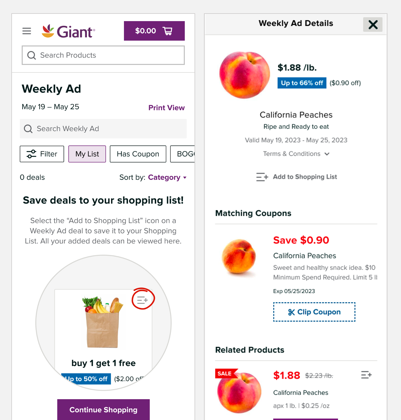
- My List - a weekly ad specific tool for list building
- Add to shopping list CTA spelled out on offer modal to connect back to the icon on the offer tile
- Back to Top CTA upon reaching the bottom of the page to easily jump up to navigation
- Full filter drawer with a wider range of options
- More robust search
With these concepts highlighted and the caveat that this case study may soon be out of date when comparing the below prototype to this live page in production... here is the prototype we created for usability testing.
Advanced Prototype
Usability Testing
Two usability tests with different goals in mind
Our final stop in the UX playbook was to put these designs in front of customers and gather some qualitative feedback. We split the tests in two:
- The first being very task focused: can the user do this, can they access that?
- The second test attempted to validate the jobs to be done.
At ADUSA, we have a pretty standard methodology for usability testing - beginning with a research brief written by the lead designer and then reviewed by their UX Research partner. We typically recruit 8-12 participants and limit each test to a handful of specific tasks with follow-up questions digging into more qualitative aspects of their experience.
For the first study, we asked:
- Can a user filter using the exposed filters? Can a user filter using the unexposed filters?
- Can a user add a weekly ad deal to their list and know where to access it?
- Can a user do a local search on the weekly ad and understand the difference between local and global search?
- Can a user navigate to the print view of the weekly ad?
Each task is the scored on a 1-5 scale and averaged across the users with a 4 and above being considered a passing score. A 4 means the user completed the task easily but with hesitation or minor errors while a 5 mean they completed it immediately, easily, and with no errors.
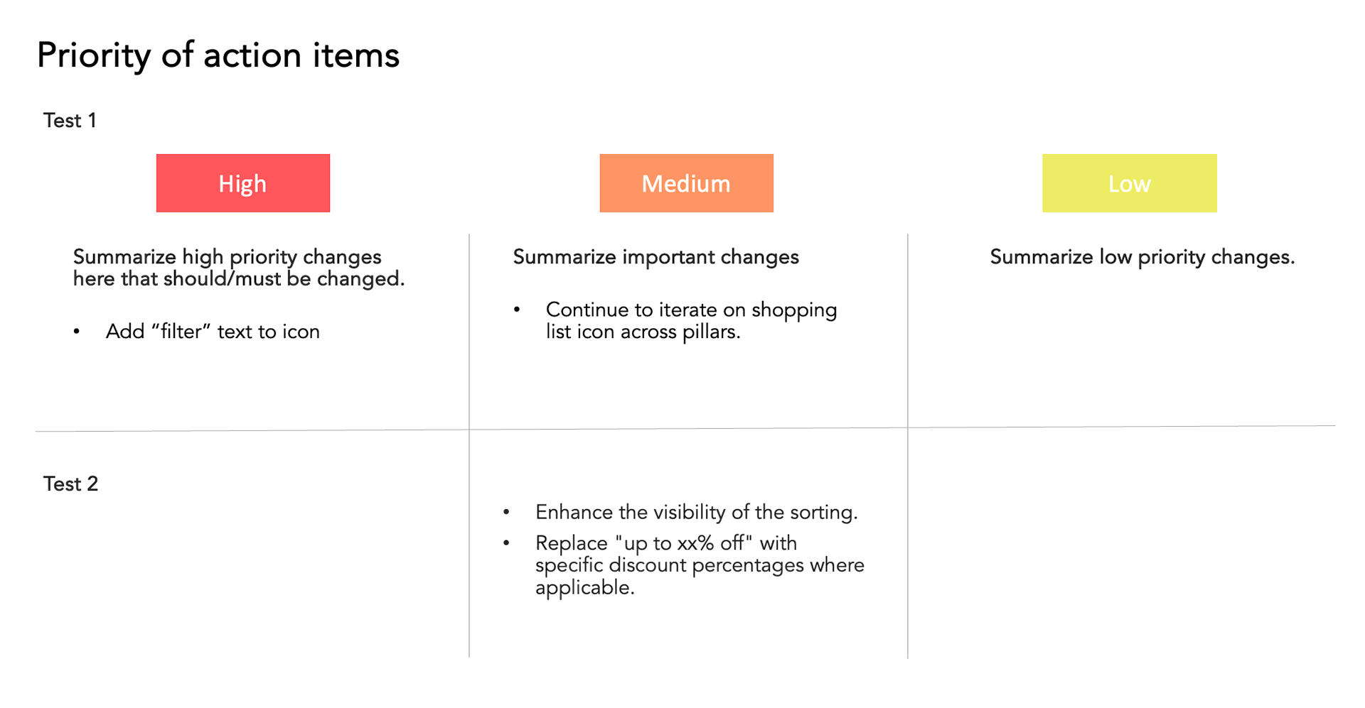
Some takeaways we observed from this first test were that we needed to reinforce the label "Filters" next to the icon for 'All Filters'. We also observed a common theme that customers had trouble connecting the add-to-list icon to that piece of functionality.
For the second study, we asked bigger and more nuanced questions:
- What are your first impressions? What do you feel you can do on this page? What are your thoughts on the organization of this page?
- Sorting by discounts - how would you organize the page to display deals sorted by the best value?
- Pricing clarity - what do you notice about the item prices and the amount of savings? What about the pricing do you think you would find helpful when grocery shopping?
This test performed very well and reinforced a lot of the design decisions we made. One improvement led to us better calling out the "Sort by" button and adding color to indicate interactivity.
Overall, everything performed quite well and aside from a few minor tweaks, we felt confident in what we were building!
Measurement Plan
...and next steps
3400 long-winded words later and we arrive at where we're at now: prepping to run the pilot and enacting the measurement plan. As stated previously, the pilot will run with one of our grocery store brands, include 50 customers across a range of data science segments, and gather contextual moments over a 4 week period.
One of the biggest changes I haven't discussed yet has to deal with how our marketing teams input this '1st party data' and what ramifications the success of the pilot may have on those teams. This is part of the reason we chose to do a limited pilot - we will need to manually clean a lot of data based on the current way these teams publish the weekly circulars (imagine a mix of InDesign, XLS, and data entry). Our designs require a clearer product hierarchy and offers need to match the taxonomy of our product assortment. Therefore, a large portion of post-pilot analysis will be documenting all of the data complexities and potential changes to workflow needed to support this effort going full-time.
We are currently in the initial stages of defining the next diary study: participant criteria, research questions, and analysis deep dives. As we get closer to the pilot launch we will collaborate with our brand partners to understand what questions they seek to answer as well. We are also working now to draft our main KPIs and measures for success for this pilot.
Assuming all goes well, our plan is to digest the pilot diary study and share out to the brands. We will then schedule 1:1 workshops with each of the 5 brands of ADUSA to understand their end-to-end workflow, unique challenges, and business goals. We will then layer-in these goals with the sentiments observed from our diary study and make any pivots needed to the next-gen weekly ad designs. One final stage of usability testing to ensure we didn't disrupt any crucial flows and we will then be ready to a/b test. The a/b test will likely roll out brand by brand with a subset of customers seeing the new experience and the control group receiving the current production experience.
Our hopes are that by structuring the weekly ad in a clear and organized manner, showing simple pricing and value, and quietly personalizing the order of offers, customers will find better upfront value and use this as the key place to kickstart their weekly meal planning. Over time, we hope that print loyalists will take a look at the benefits of digital and learn to rely on the new functionality to help save time and money.