Browse Aisles Redesign
What were we seeking to do?
Our objective was to improve the ease of basket building within our browse aisles (categories) section for our grocery sites and apps.
Why focus on this?
The vast majority of our customers build their baskets through search (~65%) and past purchases (~25%). This is true for most returning customers that are habitually building their baskets week over week. However, for new customers or those returning customers looking to be inspired, a big remainder comes from within the browse aisles section. For new customers, BA represents around 15% of their basket. Additionally, this section is meant to encompass the entire taxonomy while also serving as landing pages and jumping off points for inspiration.
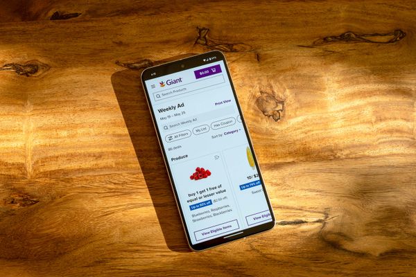
When we first launched PRISM, our white-label app to our brands, there was a big disconnect from the mobile to the desktop experience. Desktop exposed a left rail navigation where customers could see all of the subcategories (L2’s-L4’s) while also browsing products and L1 landing pages. The mobile experience, however, forced customers to dig down through the taxonomy to the deepest subcategory before ever seeing products. Imagine you want to browse for a new type of jam. As a mobile customer, you would have to tap Condiments and Sauces > Jams, Jelly and Fruit Spreads > Fruit Spreads > Raspberry Fruit Spread before ever seeing any products. This limited product discoverability by forcing customers to dig so deeply into the product hierarchy. What’s worse was that each of these taps loaded a new page.
Our goal was to show products sooner, reduce taps, and allow for easily navigating within a browse aisles category.
My Role
I led the team working alongside two design strategists, a UX researcher, and a product manager. I also put my dev hat on and helped prototype our high fidelity HTML / Vue.js prototype. In terms of overall process for this project, we went through various project stages:
- Research (landscape analysis, current state audit, gathering usage data, defining measures of success)
- Ideation (Information architecture, wireframes, low-fi designs)
- Feedback gathering (Internal, dev, and stakeholder reviews)
- Design Stage (High fidelity designs and an advanced HTML/CSS/JS prototype)
- Testing (Usability testing and designing the plan for a/b testing)
Competitive Landscape
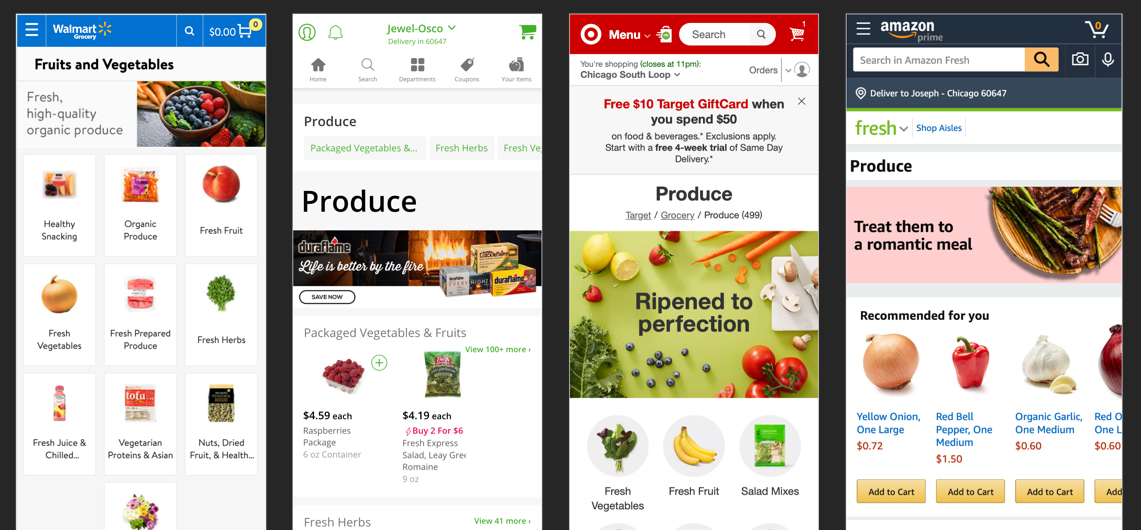
This project began by taking a close look at our competitors and running a usability study between our site, instacart, and walmart grocery. We asked users to go through a series of tasks across all three sites gauging what they liked and disliked along the way.
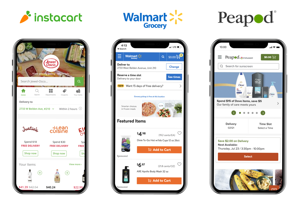
Some things we observed across competitors were that many had quick access to other categories through exposed navigation or breadcrumbs. This allowed for inspiration through seeing related areas to explore. No competitors required their customers to dig as deep in the taxonomy as we did - with most showing products either immediately or on the second level. We often observed competitors using product carousels on top level landing pages to represent a peek into some of the more specific lower level categories. And lastly, we observed many competitors using imagery to reinforce the categories rather than long, descriptive titles.
In the unmoderated usability test, we tasked 15 participants with finding 3 specific products while not using search. We immediately noticed that users quickly and easily adopted Instacart’s side-scrolling pattern. Customers commented positively on having images paired with the category names so they could more quickly identify them. On our site, we noticed a usability issue where customers would simply go home each time they wanted to add a product rather than browse through the aisles. And lastly, we noticed that names truly matter when trying to find a specific product: something our merchandising team knows all too well.
Ideation
With some research under our belts, we set out to define some of the goals for the design process based on our current pain points and moments of delight we observed in our competitors.
- Improve the ability to navigate more freely
- Allow for more discoverability of products
- Show products earlier within the shopping experience
- Organize content in a digestible and logical manner
- Delight customers with beautiful design
- Don’t change the taxonomy or current structure
With these goals in mind, we developed our key metrics for success for this project. We knew that we wanted to decrease the amount of time it took for customers to find and add products to their cart while using browse aisles. We wanted to define a new pattern that followed more up-to-date trends that would allow for a more seamless navigation across top level and sub-level categories. A simple metric we wanted to gauge was the number of add-to-carts as customers would go to browse aisles, but often get discouraged and revert back to search. Lastly, we wanted to improve customer satisfaction in this area - hoping that improved product discoverability and better design patterns would lead to this.
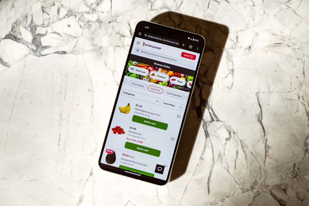
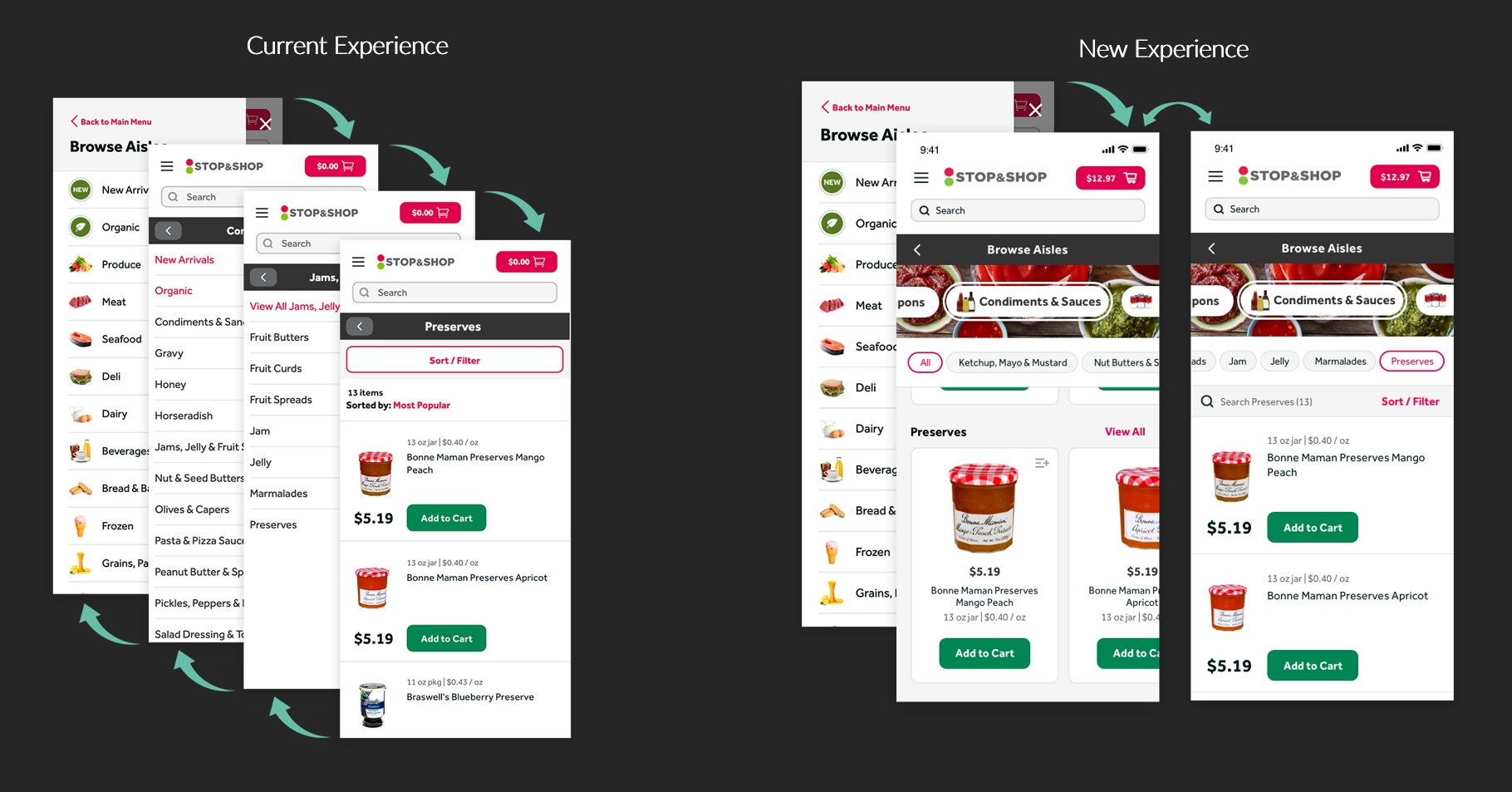
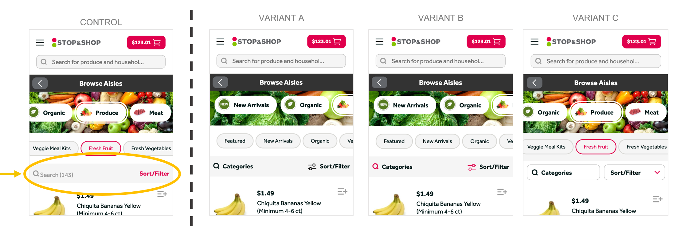
After many rounds of rapid design iteration and critique, we came away with a design that drastically reduced clicks before a user saw products and greatly improved visibility into the product taxonomy. We also separated our search and sort/filter capabilities into its own section making it even easier for a customer to narrow down their selection.
Advanced Prototype
After ideating through various approaches, we landed on a solution that we felt addressed many of the customer pain points and UX metrics for success we had identified. However, since this redesign involved a new type of interaction, we decided that an advanced HTML prototype would be needed in order to move forward with usability testing. We focused on building a similar test to what we ran in the competitive landscape analysis and asked users to navigate Browse Aisles to explore the product hierarchy and find three different products. This prototype was hand coded by myself and one of my design strategists. We worked with our merchandising partners to gather new category background images across all the different top level aisles.
This prototype was optimized for mobile usability testing, so my iframe embedded here will work best on a mobile device or touchpad. For desktop viewing, visit the prototype and select “inspect” and then emulate your favorite viewport.
Usability Testing
With the advanced prototype built using real data and product images, we put this before another group of customers to gather qualitative feedback. We wanted to test:
- Do users understand the side scrolling ‘pills’? If not initially, how long does it take them to learn and adopt the pattern?
- Do users drill down to the third level of categories & filters? If not, do they still find the right products easily?
- How do users choose to move between categories? Do they use the browse aisle nav or the hamburger menu?
Where did we go from there?
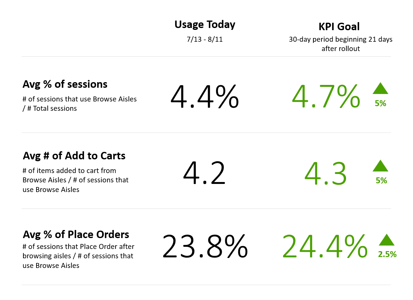
We were happy to see that this test resonated quite well with users and gave us confidence going into designing the a/b test. For the a/b test, we chose to feature flag this and test with a single brand. We used Optimizely to roll the test out to 10% of the customer base and slowly increased over a two week period. For a large change like this, we knew there would be some negative comments in our voice of the customer platform, but we expected those to level off over time.
I would like to say it was all roses and unicorns, but we noticed some of our key metrics not meeting our expectations. Specifically, we saw issues with how customers were interacting with the “search within” feature as well as sort & filter alongside a dip in our overall metrics.
In addition to a/b testing follow-up refinement to this feature redesign, we implemented an SEQ (Single Ease Question) research intercept on the browse aisles section to gather real time qualitative feedback from customers. We wanted to understand how customers of different shopping intent (in-store, delivery, pickup) might differ in how they were using this feature.
We continued to iterate before rolling this out to all of our grocery brands. Two major changes we adapted were in how our ‘sticky header’ behaved and also the naming and iconography of our Categories search. Our theory was that too much of the viewport was being taken up by top level categories, sub level, and search/sort/filter. We iterated on a few different approaches and ran further a/b tests to hone in the right balance ultimately landing on a design pattern that works well for our customers and our business.